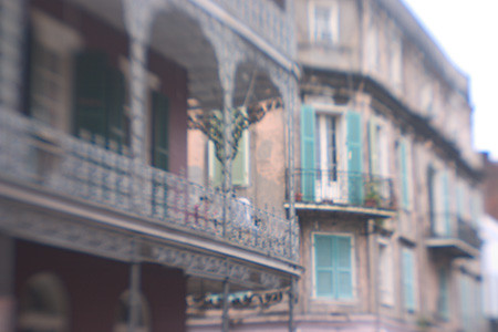
This one is pretty obvious. It’s the French Quarter in it’s French Quarterly way of looking so French (and, I suppose, ‘quarterly,’ whatever that may be.)
Makes you almost wonder what the other three look like, doesn’t it?
I’ve sent email to Kathy tell her that, officially, I’m in LOVE with Ilford Pearl paper. I have tried a few different types of paper and played around a little bit but Ilford really has me captured. I’m printing almost exclusively on that now. (Well, for the time being. Until my fleeting heart latches onto some other paper and my addication turns to that instead. I just have these nightmarish visions of myself off hunting some rare breed of paper in the wilderness now.)
When I first went into the darkroom and tried Ilford Pearl paper, many years ago, there was some “issue” with my darkroom setup and my prints came out all muddy. I remember pulling the first print, looking at it oddly and thinking, “This is the ‘great paper’ that everybody goes ‘ga ga’ over? Hmmmm. Perhaps I don’t really like Ilford…” Perhaps, I should have checked my developer BEFORE I ran the first print, right? Changing it up seemed to work wonders and I soon fell for the wiles of that paper.
Fast forward to the current digital darkroom setup. My printer was, unknowlingly, in need of a head cleaning. I put the Ilford Pearl paper, made especially for the digital ink jet printers in my printer, clicked the print button and waited. Behold, what did my eyes see? A horrible print. A mess. It looked like something a little kid could improve upon with a crayon.
So, I think, once again for the first time, “This is the paper everybody’s been going ‘ga ga’ over? It does’t look like much.”
Wrong. After the head cleaning, it looks a lot better.
I’m starting to think that Ilford should come with a warning on it’s label. “WARNING: If you are Carol and you really don’t know what the Hell you are doing, you might want to check your setup BEFORE you judge the contents of this package.” (Or something more eloquent. I’m sure the Brits could think of something a tad snappier but still get the point across to the dufus across the pond that’s just a litle too quick with the trigger, in judgement of their fine paper and chemistry.)
Seriously, that paper has just such a nice sheen to it, and I love the colors it gives me. They are soft yet somehow still shaded. It’s almost like the concept of a “rich pastel…” such a beast really doesn’t exist and, if it did, you wouldn’t know what it looked like until you saw it.
It’s the gastronomical equivalent of asking somebody, “OK, so what does milk taste like?” You can’t really answer, you can’t really explain it, you just know that either you likey or you no likey. When it comes to Ilford, just as I did in my darkroom days, I like it now that I’ve managed to work the kinks out and look at it with a clear head.
How does that line from that Robbie Robertson song go, “you like it now, but you’ll learn to love it later.”
Yeah, ok, back to framing. (I have two down, about six more to go.)
Until next time…

