I didn’t start out as a “color photographer.” I started out as someone who noticed things: an observer.
Color came later. It came slowly, almost accidentally, after years of paying attention to light, surfaces, and how the world feels at different times of day. Over time, I realized that color wasn’t something to add to a photograph. It was something already there, waiting to be seen more clearly.
Color Isn’t a Filter Problem
Sometimes, I teach photography. When photographers or students ask how to get better at color, the question often sounds technical. What camera profile? What preset? What color space?
Those things matter, but they’re not where the story of color actually begins.
No, the story of color starts with observation.
It starts with noticing how a wall changes at dusk, how reflected light subtly tints a shadow, how a single dominant hue can calm a scene—or quietly agitate it. The more I photographed, the more I realized that color is rarely about saturation. It’s about relationships.
Does this color get along with that one? What color palette was I working with and how could I add or subtract to that to improve my image?
“I Painted a Forest of Light,” by Carol Schiraldi
Colors Do Not Live in Their Own Little Worlds
A color only makes sense next to another color.
A green feels lush or acidic depending on what surrounds it. Red can feel aggressive, playful, or elegant based on scale and context. Even neutral tones are doing color work — they’re just quieter about it. But, just like that quiet space, sometimes a whisper lands harder than a scream.
One of the simplest (and hardest) exercises I know is to photograph a scene where only two or three colors are doing all the work. Not because minimalism is better, but because limitation forces clarity. You start to understand what each color contributes — and what it takes away.
For a long time, I worked with a limited color palette. Often, I still do. Not everybody notices, but it’s there lurking across my work. While my work is often seen a colorful, it seldom reads, “here’s a clown car that crashed into a Skittles factory.” That’s by design.
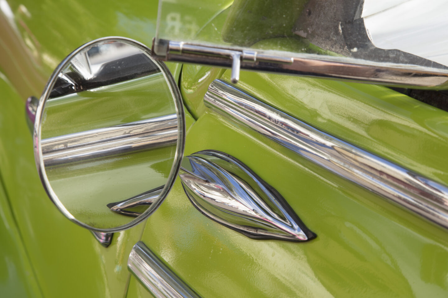
“Green Rear View,” by Carol Schiraldi
When Color Does Too Much of the Work
For a long time, I shied away from red. Almost like I was allergic to it somehow, though I really wasn’t, it was just me placing limits on myself.
Red is powerful, yes, it’s a vibrant color that catches our collective eyes, but sometimes? It’s too powerful.
I worried that red in an image could “save” a shot that otherwise wasn’t actually working. That the color itself could carry the photograph while the composition, tone, or structure quietly failed underneath. When that happens, color becomes a crutch rather than a collaborator.
There’s a line often attributed to Matisse that has always stayed with me:
A thimble of red can be more powerful than a bucket of it.
I don’t think he was talking about restraint for its own sake. He was talking about intention. About how color gains power through placement, proportion, and relationship, not sheer volume. A small amount of red, when it’s doing real work, can change the entire emotional temperature of an image.
That idea made me cautious and not just with red, but with any color that arrives already shouting.
Why Black and White Helps Me See Color Better
This is one reason I’ve spent time working in black and white, even though I don’t primarily identify as a black and white photographer. I often enter black and white competitions not because I’m trying to reinvent myself, but because converting images forces me to look at what’s really there:
Tone
Shadow
Texture
Balance
Negative space
There’s nowhere for color to hide. If an image holds together without it, then the composition is doing its job.
In an odd, roundabout way, working in black and white has made my color work stronger.
Once I’ve seen an image stripped of color, I understand it more deeply. I know where the weight sits, where the tension lives, and what the structure can support. When color comes back in, it’s no longer responsible for holding the image together. It’s free to speak, not rescue.
The best color photographs, for me, are the ones where color isn’t compensating — it’s amplifying something that was already there.
“House 210,” by Carol Schiraldi
Slow Looking Beats Fast Shooting
Color doesn’t reveal itself at speed.
Some of my favorite color photographs came from staying put longer than felt necessary. Walking away from the obvious composition. Letting light move. Allowing reflections or motion to disrupt something otherwise predictable.
Color often appears after the obvious moment has passed.
This is especially true if you’re interested in abstraction, surface, or atmosphere. Color reveals itself over time, not in a burst. Patience, grasshopper! If you wait long enough, color comes to you.
Study Outside the Photographic Lines
One of the best ways you can learn about color has nothing to do with the camera.
Paintings. Architecture. Textile design. Weathered materials. Old book covers. Artists in other disciplines have been thinking about color for centuries — without histograms or presets — and there’s a lot to learn there.
I’ve learned as much about color from peeling paint and oxidized metal as I have from galleries. Color accumulates. It fades. It stains. It carries time. Paying attention to that changes how you photograph the world.
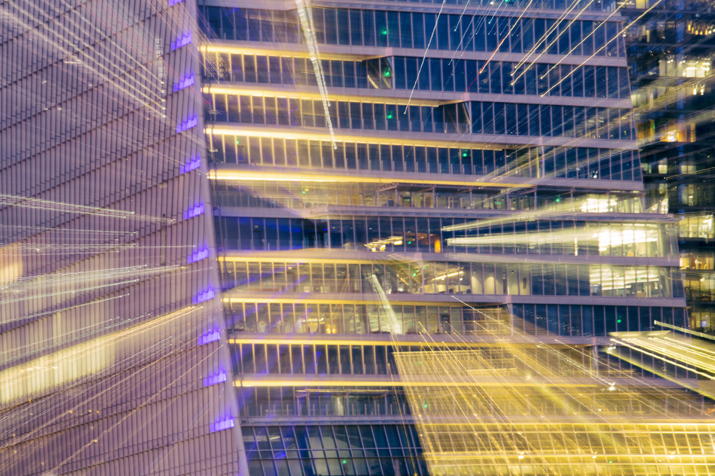
Let Color Misbehave
Some of my most interesting work came from letting color get slightly out of control.
Motion blur. Reflections. Uncertain edges. Moments where color stops describing an object and starts acting on its own. Not everything needs to be clean, balanced, or polite. Sometimes color is the subject precisely because it’s unstable.
Learning color isn’t about mastering harmony.
It’s about learning when to let tension exist.
“Exquisite Rust,” by Carol Schiraldi
Color as a Way of Seeing
I don’t think of color as my style.
No, I think of it as a way of paying attention.
The more I stopped trying to make colorful photographs, the more color showed up — quietly, persistently, and often unexpectedly. It became less about impact and more about awareness.
If you’re interested in learning color, my advice is simple: slow down, look longer, and trust what keeps catching your eye.