So, I don’t like to get into the usual blah, blah, blah, yada, yada, yada about website design and the like. I figure most of that just bores people and I’m no exception. Frankly, I get bored pretty easily with that kind of stuff, because it just makes my eyes glaze over and, why, you know I’d much rather spend my time looking at photography. Recent events, however, have lead me to post a little bit about my website design, just for those who follow along and for yours truly as well. I want to try to keep tabs on these things, so I hope you will forgive the intrusion.
Recently, I’ve been thinking I wanted to give the blog a little bit of a revamp, to kind of move things around a little bit. Focus more on the photography and less on some of the backstories and funny things. (Don’t worry, there will still be funny things. I just want it to look a little less cluttered in here really. That’s all.) So, I had an idea to add some tabs to the top of the page. You know the stuff one might usually find up there, items like “About Me” and “My Portfolio” and the like. I started down that path a while ago and never could get the dang thing to work. My blog is very old, you see, and so it just sort of breaks some templates. Anyway, I finally figured out the magic pill to swallow, the farm animal I needed to sacrifice or whatever, as that started working. Now, you can see the spiffy new tabs up at the top. Most have some text in there, but I’ll probably be adding to them as I go along. You can see the makings of my new format, starting to take shape up at the top.
As part of this spiffy new top bar introduction, I’ve decided that I also wanted to clean up the right edge of my blog. It’s a bit cluttered and distracts from the reading, not to mention I think it makes my site look a bit less friendly. It’s not as clean as I would like so I decided to tidy up over there a bit. I also wanted to add some spiffy new contact buttons so that I have buttons for Twitter, Facebook, YouTube, and the like. Yes, I know, my old design made me look a bit Amish or perhaps stuck in 1997. Damn the torpedoes, social media here I come, as I’ve decided to add buttons for connection type information. All well and good.
It was a bit tricky adding the buttons but I managed it. I had to first find the buttons which is no small feat in and of itself. You trying making up your mind which buttons you like. Oh the horror! If making up my mind were not enough, I had to then download and resize. Being a photographer, I’m a bit used to that, still it was a bit of a chore. For a while there, I had a 500 pixel sized Twitter tweety bird on the edge of my website. In case you did not catch it, let me be the first to admit, that’s one scary looking bird at 500 pixels, OK?
I wound up using a very friendly site called iconfinder.com along with help from a website called Instructables. The Instructables people told me to basically create a “dummy” blog post and cut and paste images into it. Then, edit to add my links. Then, use this code and dump it into a template widget which could them be displayed along the edges. It worked like magic after I fought with it for about ten minutes (and made up my mind. There’s still that pesky making up your mind business, which I really can’t help anybody with much. Good luck to you on that front.)
Anyway, enough of the almost techno mumble bumble. This is the new template. I think it’s a bit cleaner, it has tabs now, it’s got spiffy new social media buttons and I think it just looks a whole buncha nicer. Now, I’m still tidying up around the edges and there are some areas with missing links, text, and the like, but I really would welcome your feedback.
Does it look like we’ve weathered the spring dust up OK or should I go back to the drawing board on this one?
Until next time and maybe template this time…
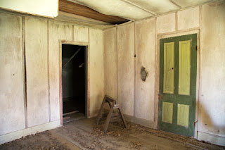
PS This one taken with the Canon 5DS and the walkabout lens. One of the historic school tour buildings in splendor of decay.

