I had a few paint colors left on my palette this morning, so I decided to whip up a quick painting, you know, one last one for EAST and all. Here it is, I hope you like it.
AHEM Kidding, kidding!
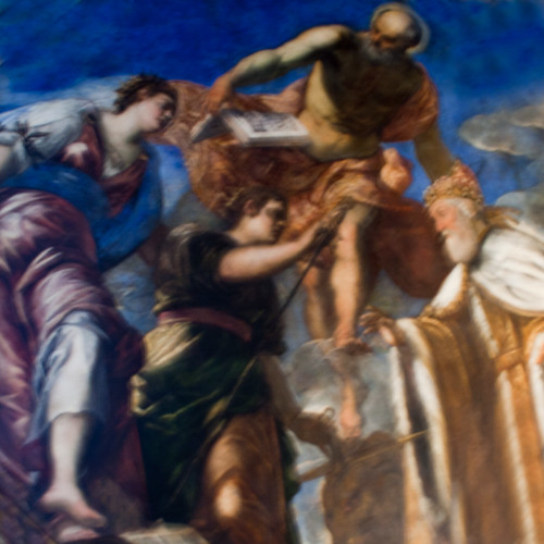
This is actually part of a well-known piece of artwork. So why am I posting it here, today? Why am I posting this instead of some of my own artwork on this, my personal blog? Well, it has to do with a question of scale, which, conveniently, is today’s topic for discussion.
How big do you think this painting is? Do you think it’s small? Large? In the middle? Is it a 16×20? Is it part of a larger work? Is it GIANT and does it SCREAM LOUDLY, “I AM A TITIAN!” or is it more humble and quiet, gently filling the space it’s in?
One of the problems with viewing artwork on the web is that we often loose a sense of scale. Not only do we drop the sense of scale in artwork, but we often misplace context as well. Allow me to explain.
If I had done this painting in encaustics, on board, on a small 10×10 panel, and put it in the room with all of our other encaustic paintings, do you think it would get noticed? Do you think folks would stop and see it, stop and look at it? It’s detailed, that’s for sure. And, yes, you can’t take away the technique of the painter here, even given an unknown scale as viewing this over the Internet. I mean, this is some fantastic paint slapping, there’s no debate about that. And the colors? Damn! I can’t get colors this good with my high-end digital SLR camera. Phew! Nice job there, old Italian painter Titian, you really pulled out all of the stops on this one. (Heh. Imagine this in “Score Me!” I’m sure somebody would give it a “2” and say it needs more “boobies” or some such thing. Rascals!)
What about if this were hanging in the Louvre, next to a bunch of other famous paintings by artists long since dead (or, perhaps even worse, forgotten) would you stop to notice it then? Would you even pay it any mind or would you suddenly bolt up, trample a truckload of Japanese tourists to death on your way to see the Mona Lisa? (Be honest now!)
The difference here is a matter of context. Put next to some fabulous other artwork, put in the same context as a Tintoretto, more Titians, and lots of lovely Leonardo’s? Yeah, even a painting *this good* can turn into a “ho hum” experience. Hard to believe, but this is true. Put it next to a bunch of beginner’s work and, would it stand out? You’d like to think so but, here again, maybe not. It really just depends upon the context, the frame of reference, and the scale. (I’m not saying here that Titian would be mistaken for a beginner, no, but what I am saying is that, in the context of a bunch of beginners, perhaps even the great Titian would be reduced to sitting in a corner, thanks in part to his work looking different from the others in its surroundings. You know, sort of not “fitting in” scale-wise or context-wise. He would stand out like an apple in a bowl of lemons is perhaps a better way of putting it.)
Many people talk about going to Florence, Italy to see artwork. It’s a city that leaves an impression upon very many artists. One of the pivotal pieces in Florence is the famed statue “David.” Carved by Michelangelo himself, “David” is perhaps one of the world’s most famous works of art. Many people have viewed “David” on the web-you can probably Google “David” to find lots of references to it. It’s all over the place. Even people who have not seen “David” in person recognize it, since it’s all over the web and has been reprinted so many times.
What many people don’t realize is that “David” is not life-sized. Oh no, he’s not. He’s actually 17 feet tall. Yes, you read that right. SEVENTEEN FEET tall. That’s a big “David.” Perhaps we should call him “DAVID” or, in something resembling “proper” Italian, “DAVIDISMO!” He’s bigger than big. He’s living LARGE, that’s for sure. Many people, upon viewing him for the first time, are unprepared for this. Even though they have seen him countless times on the Internet, even maybe seen video of him, he’s still a sight to behold in person. (“DAVID,” why hello, “DAVID!” indeed.) Instead of “shaking his hand” when you get to meet him for the first time, you get to maybe shake his “left toe.” Yeah, he’s that big.
So this brings me back to the question of scale. I absolute *love* this Titian painting, as you see it here, in small (well, small-ish) format on the Internets. It reproduces well, very well in fact, on-line. The colors really pop, thanks in part to the mastery of Titian with mixing the color palette, yes, but also because of the relative scale of the piece. The blues are “properly placed” next to the reds and such which gives this painting a wonderful sense of relative scale when reproduced on-line (if this is too technical a conversation for you, just think about it this way-the people all look about the same size in relation to one another which, you know, can be difficult to do if you are a novice painter.) But all of this “technical” discussion still doesn’t answer my original question.
How big do you think this painting is in “real life?”
That’s actually a bit of a loaded question because, while we can “judge” relative scale on the Internets (that is to say, we can answer the question of “do all of the people look about the same size? Do the people in the back appear ‘correctly’ smaller while the people in the ‘front’ of the painting look a bit larger? Like they are coming towards us from the plane of the painting?”) we can’t always judge absolute scale, in other words “how big is the overall work?” This is an easy question to answer in “real life” but much more difficult to answer on the Internets. Think of it this way, does this painting fill up a room? Is it, like our “friend” “David” actually a “DAVIDISMO!” or is it, you know, perhaps, a “davidino?” Seventeen feet tall and bulletproof or you know, like three inches across is what I’m asking here. And this question, this is what’s so difficult about viewing artwork over the Internet. Digital art, so often, looses its sense of scale when reproduced on the Internet.
As painters and photographers too (yes, even they don’t get a free pass here!) we have to think about the scale of our work. Are we making things too big? Too small? Do we want to make a “grand statement” to make our own personal “DAVIDISMO!” or are we making an intimate little “davidino?” Are we going seventeen feet tall and bulletproof or is three inches more our style?
Many photographers here are limited by their tools. So many, perhaps too many more, don’t even think about this-we simply don’t consider this when making, even printing our work. Others, perhaps incorrectly, always strive to “go big or go home” by making the largest photographic prints they can possibly make-everything here is couch-sized. Most of our printers only do 16×20 sized prints (if we are even that lucky-I’m sure many of you reading this might not be able to print larger than 8×10 or letter-sized work without using some kind of a service.) Does that really mean we should just always do 16×20 work? 8×10’s all of the time?
One of my favorite photographers, Micheal Kenna, always does small work. He prints his work small and on an intimate scale. If you’ve never experienced it, I can tell you firsthand, it’s a wonderful experience being in a room with a bunch of Michael Kenna’s. They are small, yes, but they sort of “dot” the space and they have a wonderful intimate feeling about them. They aren’t “sub par” they are just, well, small and detailed. They make you want to move in closer, to really examine them. He’s a master at doing this, even with subtle work. Other photographers work large, very large. I’ve seen billboard-sized work in galleries and certainly there’s something to be said for seeing large, splashy abstracts, especially a bunch of these together hanging in a gallery show. They look wonderful and you can get lost in the work. A few years ago, I had the privilege of seeing some of the work from the series “Elevator Girls” in person, at the Museum of Fine Arts Houston and, let me be the first to tell you, it was wonderful. They were all printed very large, on acrylic material of some kind, so they were very reflective and shiny and, wow! I really got lost just walking among them, walking around in-between these pieces. I could not have imagined them printed or presented any other way. They were fabulous. Big, giant, gooey fabulous work, done up in large scale for lots of folks to be able to explore.
My point here is: don’t just go 8×10 or “as big as it gets” and stop, no, think about how you want your work to be seen. Think about scale when doing your work, even if you are a photographer. It really helps move your work to the next level. You really should be thinking about scale even when you’re in the field shooting. I mean, it doesn’t hurt to ask yourself, “what am I going to do with these later?” You know, are you going to blow them up BIG, I mean like “David”-sized big or print them small? Postcards? Large banners? Think about scale as part of the process, just like a painter has to and this, almost always will help you visualize your work better. If you don’t believe me here, try it out, try it just once and see if it doesn’t help.
If you’ve always done small work, think about going big. If you’ve always had the “itch” to go big, think about doing small work. Try seeing what you can come up with if you limit yourself to an entire show of nothing larger than 5×7’s. Sometimes too, we allow the scale of the work to sort of “rescue” otherwise boring work. Just making something big doesn’t make it better, no, it just makes it bigger. Just like those who photograph a lot of “red” stuff sometimes use color instead of thinking about composition, so too do some photographers rely more upon scale over composition. Making “red stuff” doesn’t make stuff “better” it just makes it “red.” Photographers who do this a lot often benefit from forcing themselves to shoot in black and white. Take the color away and you’ll learn how to compose. Likewise, with scale, it can be the same thing. Don’t think about making everything “big” to save yourself, rather shoot everything thinking it’s going to be no larger than 5×7 and force yourself to bring about that “Michael Kenna” sense of intimacy about your work. You just might find your work all that much better for it. Of course, if you’re used to working small, try it the other way. Print something large, make your own “private” “DAVIDISMO!” even if just once, just to see how your work translates into a different scale. Maybe that 8×10 printer really is holding you back and you would benefit from working a bit larger.
Getting back to “my” painting here. This is a panel from the Scala d’Oro, the famous “Golden Staircase” located inside the Palace of the Dodge in the heard of Plaza San Marco in Venice, Italy. I believe this panel was painted by Titian, although some attribute it to Tintoretto and others bear not attribution at all. It appears to me to be created by Titian due to the colors used here-Titian was a master of color and really made his colors “pop” not to mention we know he was hanging around the Dodge’s Palace in Venice, as he has “other works in the show” (ahem, as it were.)
To answer the “burning” question, this is actually not a painting at all, it’s part of a ceiling panel in the Scala d’Oro. Many people, actually probably most people “viewing this” walk underneath it without even noticing it on their way to visit the “Bridge of Sighs” from the inside. Few, if any, stop to take photographs of it. This is actually a fresco that’s part of a ceiling panel so it isn’t very large, though it’s part of a larger work known collectively as the “Scala d’Oro” or the “Golden Staircase” in Venice. And, yes, the famed painted Titian, at some point, will become one of my “Painters Every Photographer Should Know” in case you are curious and want to learn more about his work with color. This “painting” is actually about 20-30 inches across, maybe a bit larger but not too much. It’s cropped here, as there are some gilded (actually “real” gold) sort of “frames” around it which are really ceiling joists of some kind (helping to hold up the plaster, I believe.) This is, perhaps a smaller work than you might think it from the Internets, although the detail and composition is striking.
No matter the scale, context, or era, this is a wonderful painting and I will always enjoy looking at it. This is one of those painting that I look at and think, “gosh, I hope I can paint like that someday,” regardless of how “big” it is (or isn’t!) I hope this discussion of scale has helped you think about your own work in a new or different sort of way.
Until next time…
Author
I was right, I thought to myself it's on a ceiling. And it is!!! Great article-could go in a magazine or to teach a class. Yesterday I printed off some of my 2000 photos of Iceland, actually just 8X10 inches. Maybe next time I'll get braver. It was fun to see them and how I need to frame them and place them on my wall somehow. Fun!
Author
It's an amazing ceiling. Thanks for stopping by.