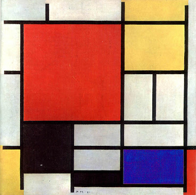
Pieter Cornelis “Piet” Mondriaan, known as Piet Mondrian, was a Dutch painter, born in the Netherlands in 1872 into an artistic family. His father was a drawing teacher and his uncle a painter. As a painter with such a distinctive style-shown here one of his trademark paintings consisting of white ground, a black linear grid, and blocks of primary colors, you might have expected him to start painting abstract geometric forms at an early age as well, but he didn’t. He started, like many artists, with the landscape-his inspiration was to study nature, spirit, and philosophy through his work. Many modern day painters and historians, in fact, comb through his earlier landscape work, looking for signs, for roots of his abstract work to come. Indeed, they can almost find them, as his landscape work became increasingly abstract until it gave way, completely, to the abstract geometric forms you see here.
Mondrian is an extremely well-known painter throughout the world, and his style of working with the geometric abstract has often been imitated. My first introduction to the Mondrian style, for example, came about not because I frequented museums in New York as a child (though I did) but by much more primitive means-the Partridge Family Bus. There is a Mondrian hotel in Hollywood, a Mondrian-inspired condominium in Singapore, there have been Mondrian clothing lines, and even Mondrian-inspired cosmetics. That old familiar white ground, the geometric arrangement of color blocks, that black lined grid, had really gotten around the art world as well, with many painters too working in a Mondrian style or inspired by Mondrian.
What Photographers Can Learn From Him
The geometric arrangement of primary colors on a white ground is the Mondrian trademark, but Mondrian can teach us more than that. For starters, a white ground does not have to be boring and Mondrian worked with white space very efficiently. There’s a rhythm and method to his lines-his work represents a careful arrangement of a linear form. Mondrain’s work can teach us how lines, shape and simple forms accented with punches of color add depth. When you look at Mondrian’s work, look at how he was sort of “playing” with what recedes and what comes forward. Then, ask yourself, as you look through your viewfinder, can I arrange this better?
There’s no “burnt umber” or “sienna” on his palette, no four hundred colors from the latest Daniel Smith catalog-it was all red, yellow, blue, black and white, but the colors really came second to the interplay of space and line. I think one of the key “tells” (if you will) of a photographer who paints is space-painters are forced (maybe willing is a better word?) to play with, to work with space. Paint forces us to define what it going to come forward, what jumps out, what’s “negative space,” and what isn’t. Photographers, especially beginners who have never painted, sometimes lack this element-they fail (sometimes) to grasp how space, how that 3-dimensional world, works in a 2-dimensional medium, so consequently, their work can lack a certain depth. Look at the “two faces and a vase” optical illusion to see what I mean about working with negative space-this takes what Mondrian did sort of to the extreme but it might help explain the painters view, if you’ve never worked with paint and can’t see it in Mondrian’s work (at first.)
Another key take away from Mondrian is that, just because something is often imitated does not make it off limits. Seeing the value in geometric abstraction can create new, interesting work, and moving it out of the painter’s world brings a new medium into play. Mondrian was so influential, you can perhaps even find or see how his linear influence would impact the photographic world. Look at the work of somebody like Friedlander, for example, and what do you see? Lots of vertical compositions coupled with strong linear constructs-lines defining a frame, lots of geometric shapes, frames within the frame. Sound familiar? This Friedlander image has his trademark lines and “frames within frames” and, after seeing his work in person, I would be surprised to find out he never saw a Mondrian piece.
Frankly, I don’t even have to look much beyond my own Flickr stream to se e Mondrian’s influence. The image that you see here of the blue windows was taken in Santa Fe. Though it does not have the “punchy” primary colors, I noticed the Mondrain-like pattern in the windows and opted to compose my own personal little “tribute” to Mondrian, using “Santa Fe blue” instead of his typical primary colors. It’s not as strong a piece as either Mondrian’s work itself, or the Friedlander piece, but it can help demonstrate how the Mondrian influence-that old familiar grid, those primary colors, those lines and that white space, can have an influence on the world of photography too.
—————————————————————————————————————
This is next in a series called “Painters Every Photographer Should Know.” The painting shown here is Piet Mondrian’s Composizione 1921. Please note that the paintings in this series are not copyright the author of this website, may be subject to international copyright law, and are provided her for educational purposes only.
