So, I’ve been looking a bit at color lately. An interesting thing about color, it’s both a design element and, sort of, a design non-element both at the same time. What I mean by that is that as artists, when we make compositions, we think of points, lines, shapes, sometimes even contrasts, yes, but not always color. Yet color plays into that mix. Color often defines how we see points, lines, shapes, even contrasts. Perhaps the most important “color” of them all is in fact black since it serves as a backdrop for all the other colors. Tints, tones, shades, shadows all get combined by mixing hues with white, grey, or black. Color never exists in a vacuum, no, colors are always (well, almost always) reflected off of one another. It’s incorrect to speak really of “color” in fact, a more accurate assessment would be to discuss palette, as colors interplay with one another, and our perception of one color is, almost always, tampered by it’s neighbors. There are so many aspects to color, it’s so complicated, yet it’s also really so very simple as well.
Good artists work with color a lot, even if they limit their palettes to a more monochromatic likeness. Think black and white photography is not about color? Try working tones someday. You still have to know all about color because we live in a color world, even if you do try to reduce it to its black and while elements. Simply put, you cannot be tone poet if you don’t know how to work with color, even if your work itself is black and white.
Artists can have “color signatures” as well. We tend to favor certain palettes, for whatever reason. Some of us love the bold, splashy stuff while others prefer a more muted palette. But, muted colors are colors too. They can reveal as much (or as little) as we would like them too. Biology and psychology both factor into our color choices. Pink tends to calm us, red makes us hungry. Other colors, like purple, have an association with things like royalty, which comes more from psychology than biology. As predators, we tend to see our prey in contrast with its surroundings and other predators in different colors. There’s a reason the deer look like the bushes and the tigers look orange with stripes to our eyes-colors serve to help keep us alive and well fed!
When we talk about color, we talk about things like contrasts and harmonies. There’s an interplay of color, sort of like a great tango that happens while we aren’t really noticing. Colors dance with one another to form patterns, lines, shapes, and other design elements that we see, but we often neglect the color aspects of design. Of course, we often go the other way, and focus only on the color aspects of design, while neglecting the “big” picture. (I’ve been guilty of this myself…oh, look, shiny red!) It’s easy to use color as a sort of “cop out.” One could make a career out of shooting say red things, but is that really good design and composition? Would a more selective color palette be more meaningful and provide more of an emotional connection? (I don’t think there’s a blanket yes or no answer to that question really.)
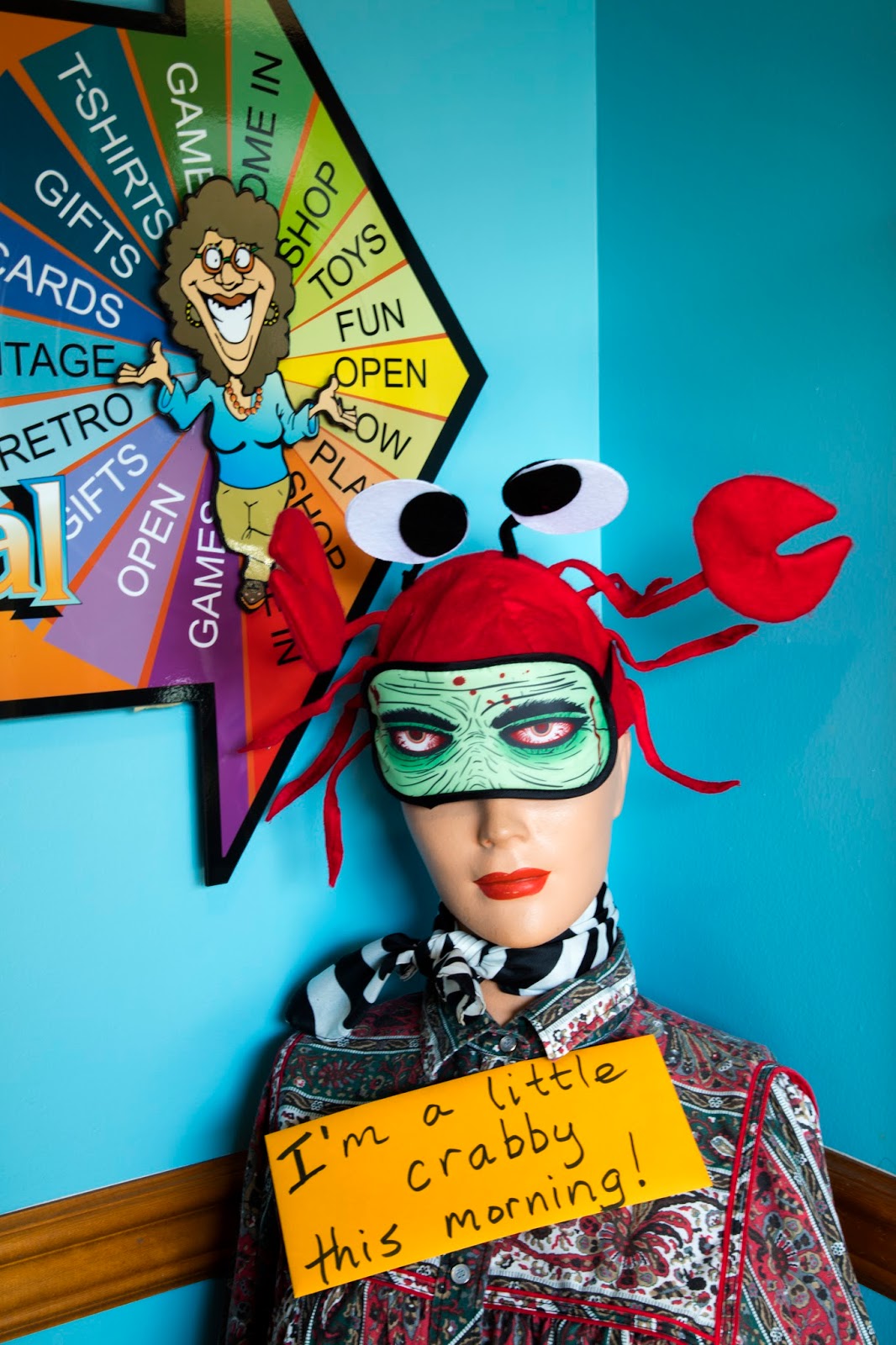
I would have to say my color signature tends to favor the browns and neutrals more, especially cooler toned colors like blues. At least, that’s how it feels now. Of course, I still love quirk-shooting oddball things, and these things tend to be more brightly colored (like the image you see here.) Being a photographer, I don’t always get to pick my reality, sometimes, you have to take it when you can get it. While I’m no stranger to that, I have been trying to work with color a bit more recently. Paying attention to my color palette, trying to think about adding design elements, about how I work with contrasts and tone. It’s just all more to think about when shooting or crafting a composition and something I hope will eventually bring my work to new levels.
The process has me learning to describe my work a bit more too. Color and quirk, slightly minimal with hints of tension. Playing with scale, working line. It’s just kind of what I do, how I tend to see the world around me. Well that and, I’d guess, a bunch of little houses. (I like to shoot little houses for some reason.) Have you thought about the role color plays in your work? It can be an interesting exploration for artists of all levels.
Color, it’s not just for breakfast anymore.
Until next time…

Author
Someone once said to a friend of mine 'You will be the last person to realise that you have developed a style', and I can see how that must be true. I remember also saying to you once that I spotted your photograph in an exhibition immediately, without looking for the name, whereas you had forgotten which image you had submitted and had to look for your own! Having said that, I think you've summed up nicely your style in terms of colour palette. As for mine, I would describe my colours as happy! I'd also like to develop a more muted palette, reminiscent of a dreamy garden in the late afternoon on a warm September day…. but I haven't managed to achieve that.